Wyckoff Part 1: How Price Moves in a Market Cycle
In this first part, we will explore the basic elements of Wyckoff, including the market cycle and price trends.
We will answer the question: How does price move?
The Wyckoff Market Cycle
There are always many different types of participants trading in the market.
To simplify, we will consider that there are 2 main groups of participants: institutions, called the CO (Composite Operator), and retail traders, also called the public, or weak hands.
A market cycle is complete when it has all 4 phases: accumulation, uptrend, distribution, downtrend, together with the participation of the CO and retail shown in the chart below!
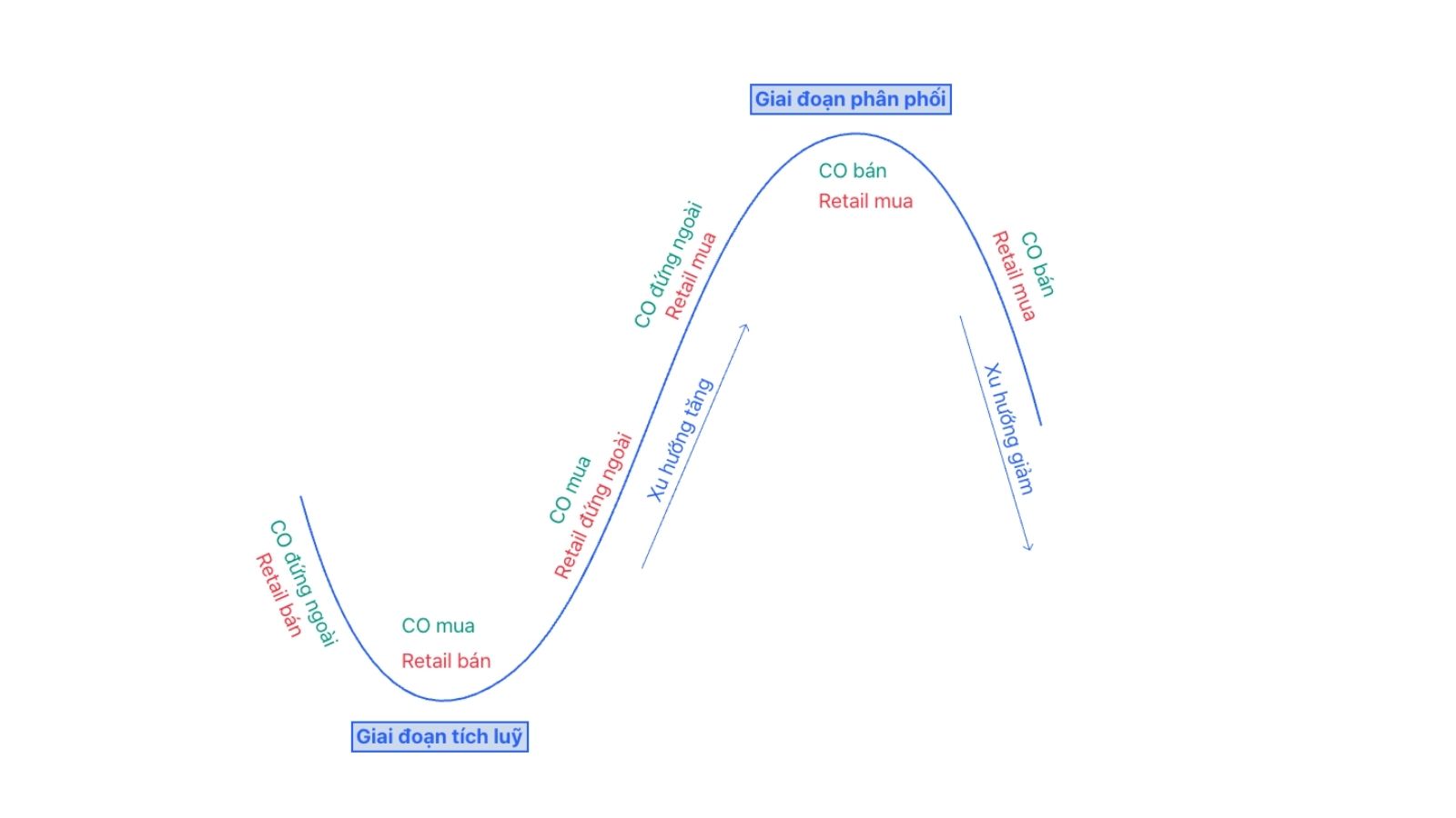 Figure 1: The market price cycle
A full cycle occurs on many timeframes, so we need to analyze across multiple timeframes, each of which may be in a different phase. Combined with the market context, this can help us analyze accurately.
The market cycle in the chart above comes with the psychology of the participating sides as follows:
- When price is falling sharply after a series of bad news, and the market is experiencing a sell-off due to capitulation, the CO is the one accumulating the cheap goods that retail are selling.
- After the CO has accumulated enough, retail have nothing left to sell. At this point, very few people are selling into the market; there are only buyers, causing price to start breaking out to the upside. The CO continues buying in the uptrend while retail do not yet dare to buy because they do not yet have enough confidence, or they will sell whatever little they have left.
- Near the end of the uptrend, good news continuously appears, retail fear missing out (FOMO) and rush in to buy at any cost. Newcomers (F0) standing on the sidelines also rush in to buy. At this point, the CO stands aside, observes, and plans to distribute.
- Price has risen very high, and the CO begins to distribute in a planned way so that price does not fluctuate much. Because the public still has strong faith in the uptrend, they continuously buy, allowing the CO to distribute at expensive prices.
- After a period of the CO distributing to the public, very few people still want to buy at high prices, causing price to break down. The CO will continue selling in the downtrend while retail are thinking this is only a correction and continue buying in the hope that this price is cheap enough.
Looking at the cycle above, you can understand why we are always the losing side. Even when we know this chart, the result is still the same, because we do not know where we are!
That is why Wyckoff advises us to act like a CO. This is not easy at all, but Trading Hub 3.0 will guide you to acquire the mindset of a CO through this series of articles!
Trend
A famous saying in the trading world: Trend is friend. Trading with the trend usually gives us better results than trading against the trend.
What is a trend?
A trend is the direction of price movement over a certain period of time. To determine a trend, we draw a trendline, describing the angle of the rise or fall.
When price is moving and meets a trendline, it will either break through that line or turn around and reverse.
The price area where price touches the trendline is an excellent location to enter a trade.
To explain why price moves, please read about The Three Laws of Wyckoff in Part 2.
Classifying market trends
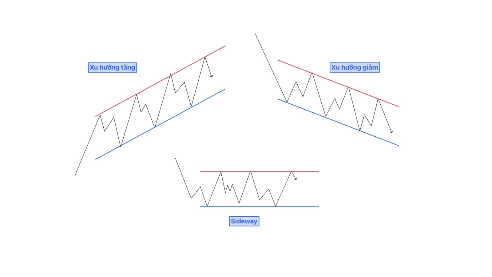 Figure 2: Three types of market trends
Depending on the direction of price movement, we can classify trends into three types:
- Uptrend
- Downtrend
- Sideways trend (can be called sideways or no trend).
These three types of trends correspond to Figure 1 in the market cycle section.
In Figure 2, an uptrend appears when price creates rising impulse waves and pullback waves, i.e., higher highs and higher lows.
Conversely, a downtrend appears when price creates lower highs and lower lows.
A sideways trend appears when highs and lows remain unchanged, fluctuating within a price range. The sideways trend is precisely the accumulation or distribution phase in Figure 1.
In terms of time, trends are divided into: long-term, medium-term, and short-term. We can observe a short-term trend inside a medium-term trend, and then we observe a medium-term trend inside a long-term trend.
How to draw a trendline
Uptrend line
In an uptrend, the trendline is drawn by connecting rising support points. It is also called the demand line or support line because it marks the location where buyers repeatedly appear.
In Figure 2, it is the blue line of the uptrend.
Downtrend line
In a downtrend, the trendline is drawn by connecting falling resistance points. It is also called the supply line or resistance line, because it is where sellers repeatedly appear.
In Figure 2, it is the red line of the downtrend.
Sideways trend line
A sideways trendline is connected between horizontal resistance/support points.
Most of us can trade favorably if we encounter a clear uptrend or downtrend. But when we encounter a sideways market, the rate of hitting stop losses will increase significantly.
We will study the sideways trend (trading range) in later articles.
What is a trend channel?
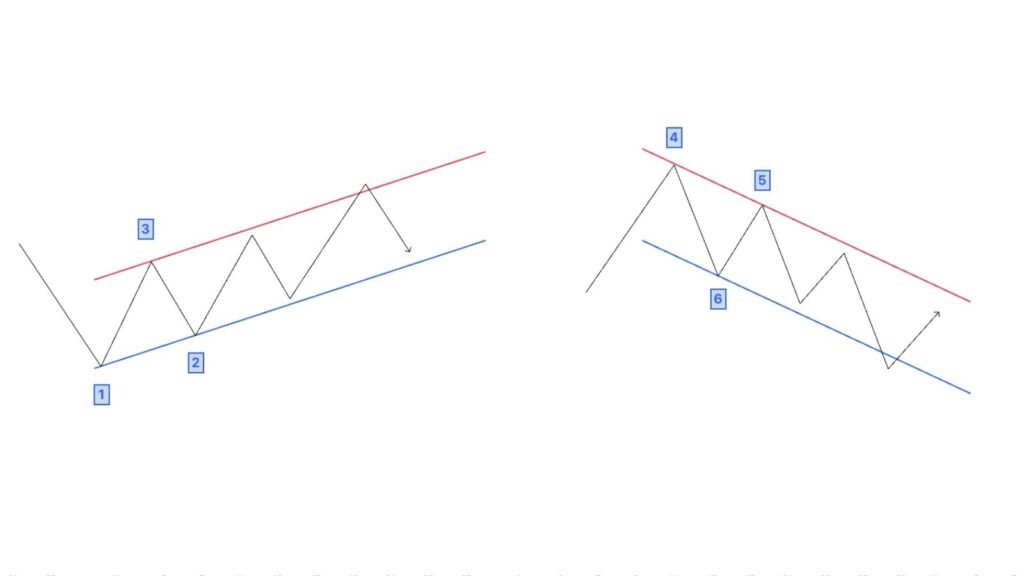 Figure 3: How to draw rising & falling price channels
A trend channel consists of two parallel lines, a supply line and a demand line acting as two price resistance and support lines.
The trend channel is an important part of Wyckoff, so I hope you do not skip this section!
Ordinary trend channels
In a rising price channel, the demand line is the uptrend line connecting two points at the bottom (points 1 & 2), and the supply line is drawn by drawing a line parallel to the demand line from an anchor point in between (number 3).
Similarly with a falling price channel, the supply line is the downtrend line connecting two points at the top (4 & 5), and the demand line is drawn parallel to the supply line from an anchor point in between (number 6).
Drawing a trend channel should not be too mechanical; sometimes we can change the anchor points to suit the direction of price.
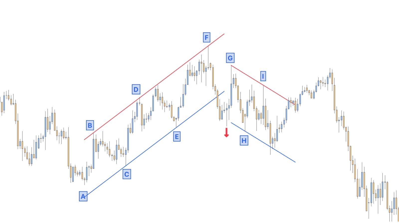 Figure 4: A price channel line changing from rising to falling
Figure 4 shows that choosing points C and E was a good judgment for drawing the support line for the rising price channel. The supply line parallel to CE drawn from peak D performed its role well when it was also the resistance line for points B and F.
If we hastily chose points A and C to draw the demand line, the trend channel would not fit the direction of price.
When analyzing a rising channel, pay attention to the character of the rally after price breaks the demand line: If price breaks the demand line lower than normal, price may fail in its attempt to return to the top of the rising channel. But if price recovers and rises to create a new high, the uptrend will most likely continue.
Looking back at the example in Figure 4, we see that price broke the support line downward (red arrow), and when price attempted to return to the top of the rising channel it failed (point G). This led to price forming a falling channel afterwards.
Reversed trend channels
Some uptrends will not fit neatly into a normal rising price channel in the way drawn above, due to a steep slope or because the trend has not yet formed clearly.
We will reverse the order of drawing the two support and resistance lines, called a reversed trendline (or opposite trendline).
- To draw a reversed uptrend line, start from peaks 1 & 2. And to create a reversed rising channel, draw a parallel line through bottom 3 located between those two peaks.
- To draw a reversed downtrend line, start from bottoms 1 & 2. And the parallel line drawn through peak 3 located between those two bottoms will create a reversed rising channel.
Figure 5 shows opposite price channels, drawn by drawing the opposite trendline first with a dashed line to distinguish it from an ordinary trendline.
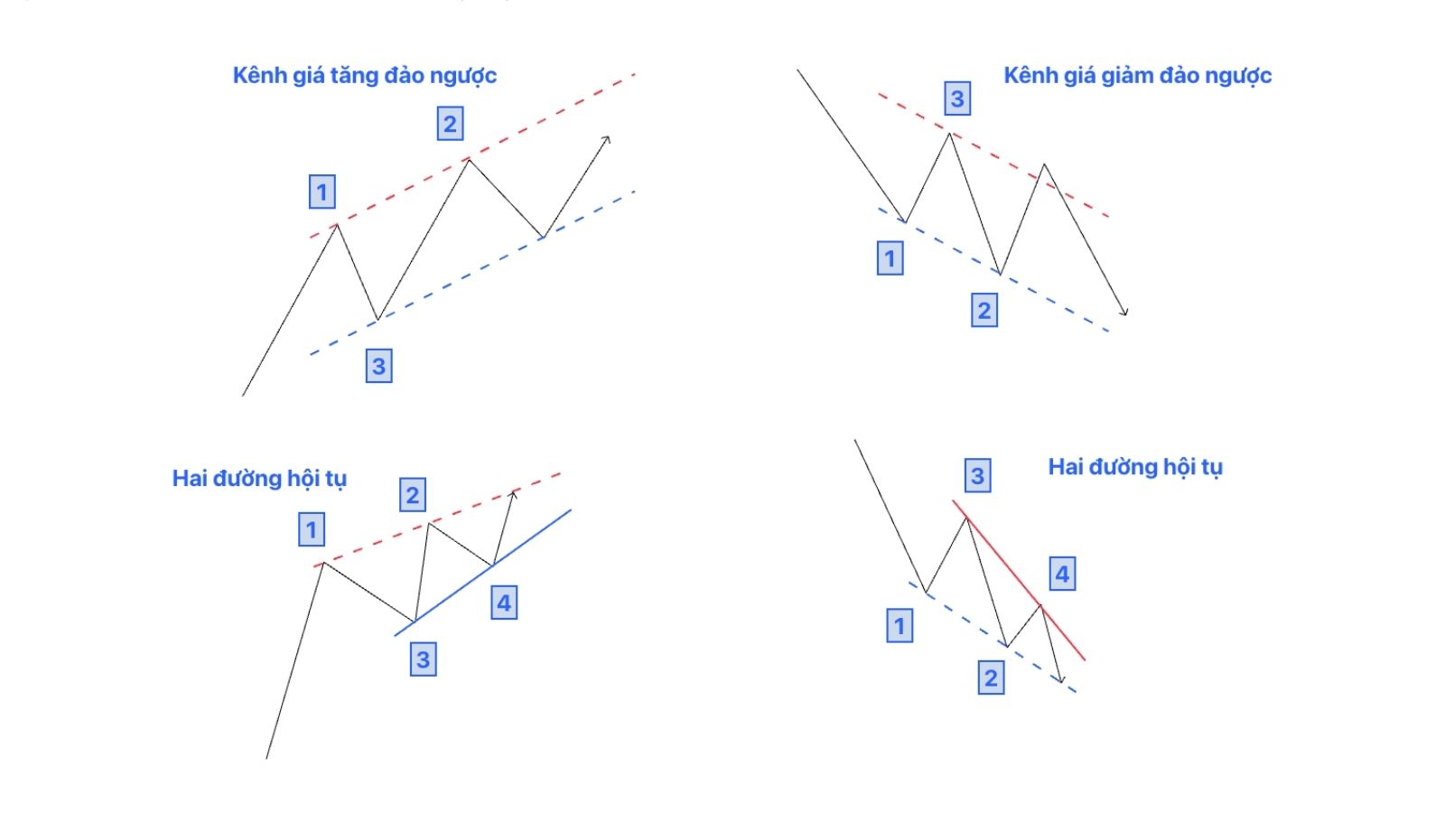 Figure 5: Reversed trend channel and two converging lines
In many cases, an uptrend line and a reversed uptrend line will converge into an upward flag shape (also called a wedge or an ascending triangle). This happens similarly with a downtrend, where we will have a downward flag.
A flag appearing in an uptrend shows that the rally is tired and losing momentum. In a downtrend, this is a sign that the decline is about to end.
This is the SOT (shortening of thrust) phenomenon that we will learn about in later articles.
An important point that I will frame to emphasize: a **false breakout** price movement through a reversed channel/trendline can lead to a reversal of the price trend.
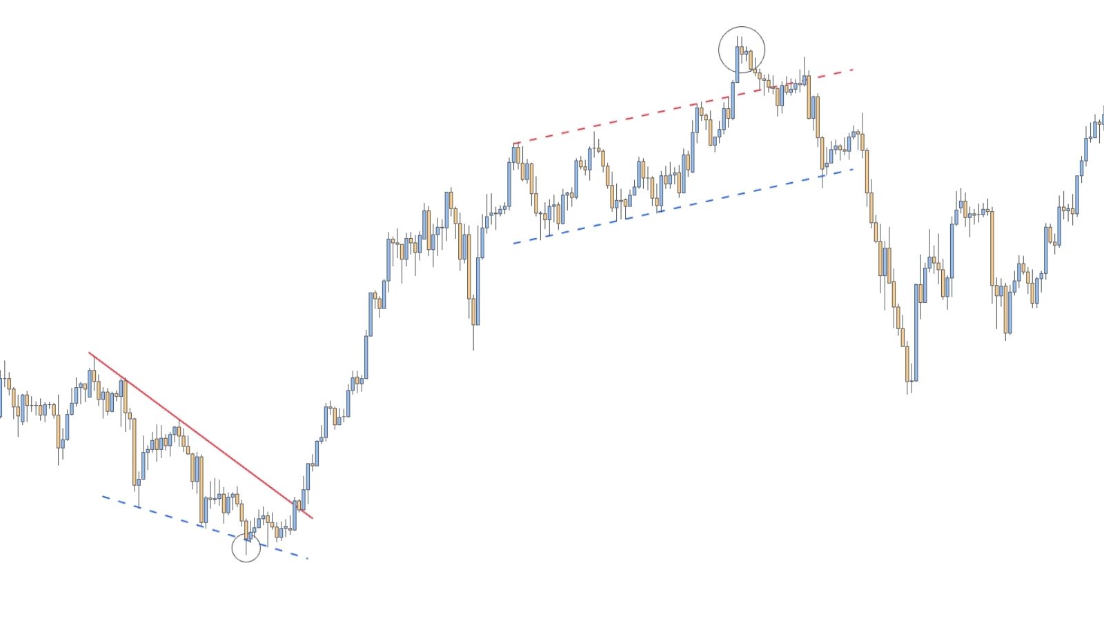 Figure 6: Price reverses after a false breakout of a reversed trendline
The USD/JPY chart in Figure 6 shows that after price broke through the reversed trend channel/line, price reversed afterwards.
Once a trend has formed, it will continue to persist until there are clear signs that the trend is ending.
Breakouts through these channels/trendlines can be a Spring/UTAD of a diagonal Wyckoff range, or they can also be the beginning of the appearance of a sideways Wyckoff range.
Note: Some price trends do not follow any price channel because they are too steep. Drawing support/resistance lines, trendlines and price channels requires open thinking (you can also combine them with Fibonacci channels). You must always consider different possibilities, so that the price channel contains most of the price movements up to the final point.
The meaning of lines and price channels
A newcomer to trading often applies a breakout strategy, entering when price breaks out of a trendline. Or entering a reversal trade every time price touches the edge of a price channel.
→ This is completely wrong.
You should not buy or sell simply because price touches or breaks through a trendline.
Channels and trendlines tell you who is in control of the market.
- A rising channel indicates that buyers are in control.
- A falling channel indicates that sellers are in control.
- A sideways price channel shows signs of balance between the two sides.
Therefore, the meaning of these lines is that they give us a view of market psychology, and determine a temporary bias.
Using lines will be most useful when combined with a method like Wyckoff.
If we determine that price is at an interesting location, instead of buying immediately we can wait for price to develop as it forms a clear accumulation/distribution structure.
For example, in Figure 6, the event of price falsely breaking through the upper edge of the reversed price channel is precisely a UTAD in a Wyckoff distribution structure, suggesting a suitable sell point for us.
5/5 - (4 votes)
Read structure 10x faster with JUKA
JUKA maps SMC structure — swings, BOS, CHoCH and inducement zones — automatically on any TradingView chart. No more hand-drawing structure for hours.
Get JUKA — $150